What's Really Warming the World? Compare and Contrast.
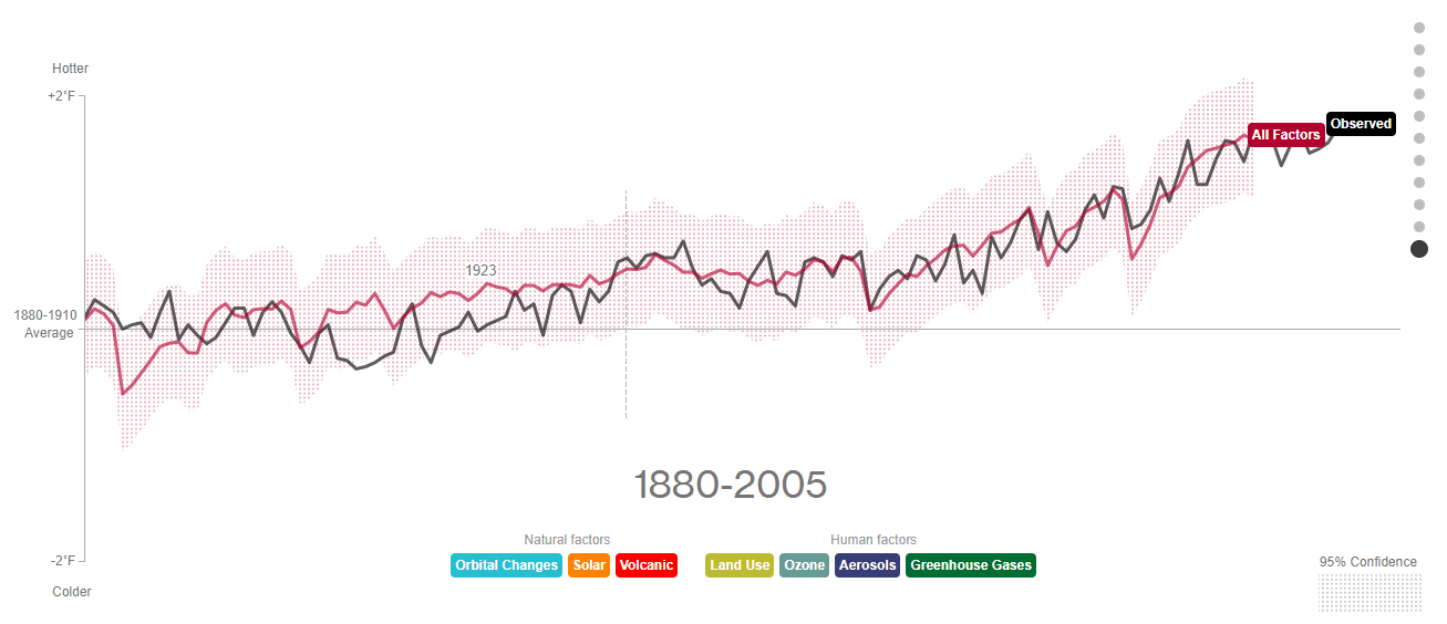
Bloomberg have produced a brilliant interactive infographic that is well worth having a peek at. It uses NASA modelling and the data and methodology are there for the reader to access. Please check this out here; it'll just take a minute or two.

Stay in touch! Like A Tippling Philosopher on Facebook:
A Tippling Philosopher